A black and white kitchen looks modern rather than like a 1950s diner when three things are true: the proportion is roughly 70 percent white, 20 percent black and 10 percent something warm, the black is matte and used on flat surfaces rather than trim, and there's real wood somewhere the eye lands. Both a sophisticated black and white kitchen and a diner are high-contrast and graphic; what separates them is material language and proportion, not the colors. Our own kitchen is the mild version, white shaker cabinets with a matte black faucet and pulls, but the full black and white kitchen I know best is my sister's, in a 1970s ranch in Beaverton, which I project-managed for her last year on a budget that was tighter than she'd planned and a schedule that was longer, and it took one bad decision (checkerboard tile samples on her floor for a week) to understand the diner risk. This is the guide: the proportion rule, the material choices that read modern versus retro, the lighting that keeps the palette from going cold, the warm element that saves it, the budget breakdown, and what I'd change.
The 70/20/10 proportion, and why diners get it backwards
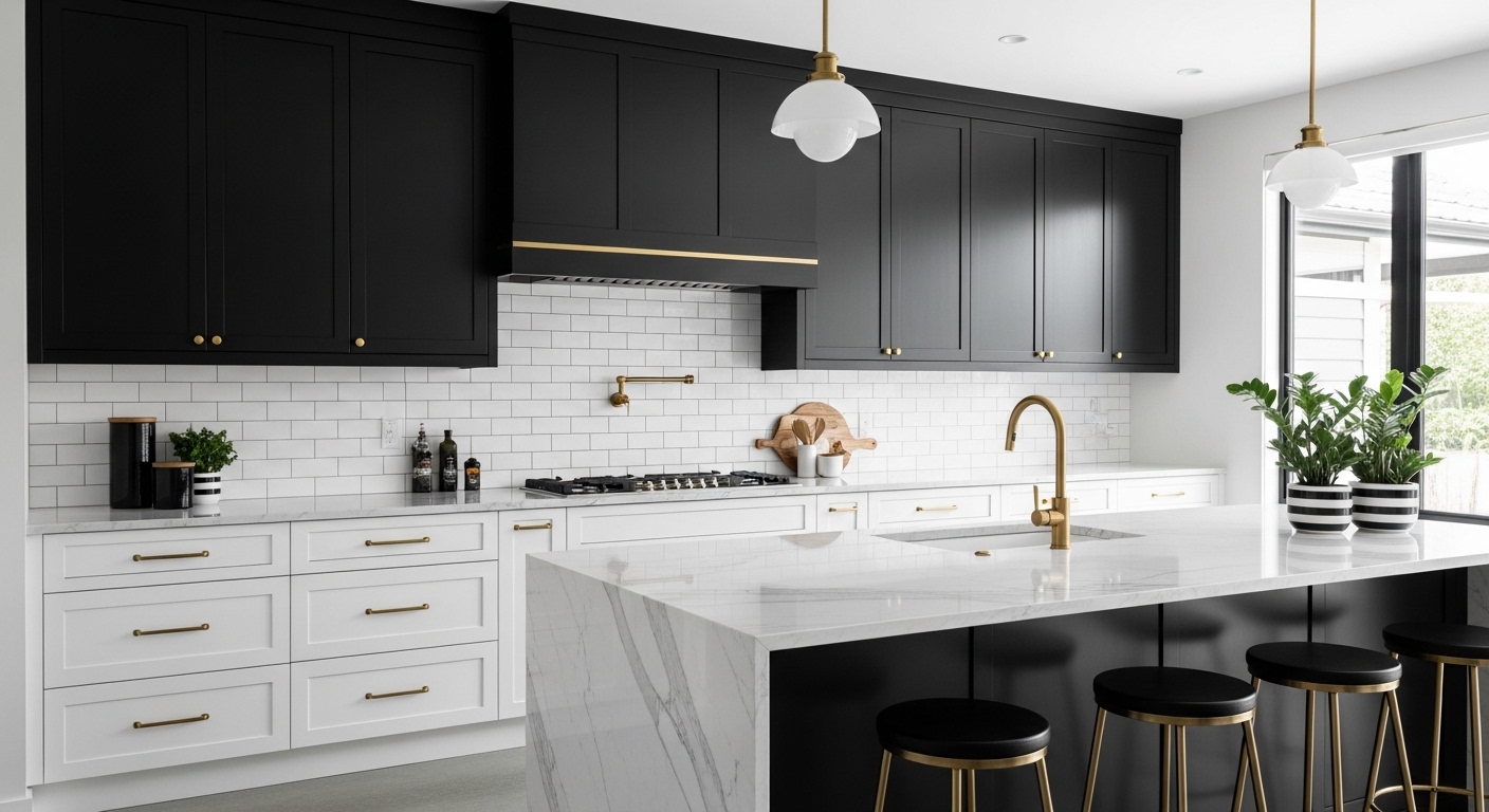
A diner is 50/50: checkerboard floor, black and white tile in equal measure, chrome edging everywhere. The eye reads equal contrast as pattern, and pattern at that scale reads as retro. A modern black and white kitchen is 70 percent white or near-white on the large surfaces (walls, upper cabinets or open shelving, counters, ceiling), 20 percent black on a few flat planes (lower cabinets, the island, the range hood, window frames), and 10 percent warm (wood, brass, leather, a plant). My sister's: white walls and white counters, matte black lower cabinets and hood, a white oak open shelf and butcher block on the island. When we laid the samples out on her floor at 50/50 for a week, my daughter asked if Aunt Jen was getting a milkshake machine.
Floors: the fastest way to look like a diner or not
Checkerboard floors: diner, every time, even in marble, even at scale. Large-format tile in a light tone, 24 by 24 or bigger, porcelain in a stone look: modern. Wood floors in a mid or light tone, which is what a ranch usually has under the vinyl: the best answer, because the floor becomes the warm element for free. We found the original oak under two layers of 1980s vinyl, refinished it for $1,100, and it's the reason her kitchen doesn't need a wood island top to feel warm, though it has one anyway. Black floors are possible in a large kitchen with a lot of light and hard to keep looking clean in a small one; hers is 11 by 14 and it wasn't an option.
Tile and backsplash: format and grout decide the era
White subway tile with black grout reads retro at the classic 3-by-6 size and contemporary in an elongated 2-by-8 or 3-by-12 format, stacked rather than offset. White subway with white grout reads clean in any size. Black tile as the backsplash, matte, with black grout, reads modern in a small dose behind the range and heavy across a whole wall. Large-format white or pale stone slab, or a porcelain slab, is the cleanest modern move and the priciest. We used 3-by-12 white matte tile, stacked, with a pale grey grout, behind the whole run, and black 2-by-8 matte, stacked, behind the range only, which is a 10 percent black gesture in a white field and is the part of her kitchen people photograph.
Cabinets: flat fronts, matte black, and where the black goes
Flat-front cabinetry in matte black is consistently modern. Shaker fronts in black read farmhouse, which is fine if that's the plan and it wasn't ours. High-gloss black is bold and shows every fingerprint and dates faster than any other choice on this list; it was the kitchen of about 2012. Where the black goes: the lowers, the island, or the tall pantry run, never all three. Black lowers with white uppers or open shelving is the safest arrangement because the black sits in the bottom third of the room where it grounds the space, and the eye-level band stays light. She has black lowers and a black island, white open shelves instead of uppers on one wall, and a single white tall cabinet. The room reads as light with a dark base, which is the proportion talking, and it's the layout I'd recommend to anyone who asks and several people who don't.
Countertops: the white that isn't cold
White quartz with a soft grey vein, honed, is the modern default and the one in both our kitchens, because it reads as stone without the maintenance and the veining keeps a large white surface from looking like a lab bench. Pure white gloss quartz is the lab bench. Marble is the traditional answer and etches with lemon juice; if you're the kind of person who wipes up immediately, it's lovely, and if you have a seven-year-old, it isn't. Black counters on black cabinets swallow light and need a very bright kitchen. Butcher block on the island, in white oak or maple, is the warm 10 percent and it's where her family eats breakfast; it needs oiling four times a year and it's worth every one of them, which I say as the person who does the oiling when I visit.
Hardware and fixtures: matte black, and one place for warmth
A matte black faucet is the fixture that anchors a black and white kitchen in the contemporary direction; chrome reads as classic or retro in this scheme, and brushed nickel reads as a compromise. Cabinet pulls in matte black, long bar pulls on the flat fronts, in one size across the kitchen. The one place we allowed a second metal is the pendant lights, black shades with brass inside, so the warm glow at night comes with a warm metal to explain it. In my own kitchen the pendants are the brass glass ones from my island pendant post and the black is the faucet and pulls, which is the same rule run the other way. Either way the finish palette is matte black, plus one warm accent, plus wood. Three finishes, per the rule in my finish post.
Lighting: the thing that keeps black and white from going cold
Black and white in a kitchen lit with 4000K "bright white" bulbs looks like a showroom at closing time. The palette needs warm light, 2700K everywhere, on dimmers, from more than one direction. Hers: three black pendants over the island, spaced and hung by the rules in my island pendant guide; under-cabinet LED strips at 2700K along the whole run, the same setup as my under-cabinet post; and recessed lights on a dimmer for cleaning up. At dinner the recessed lights are off, the pendants are at 50 percent and the strips are on, and the white surfaces go cream and the black goes soft. At 4000K the same kitchen photographed grey. We tested both for a week before choosing bulbs, and it's the single cheapest decision in the project.
The warm element: what to add and how much
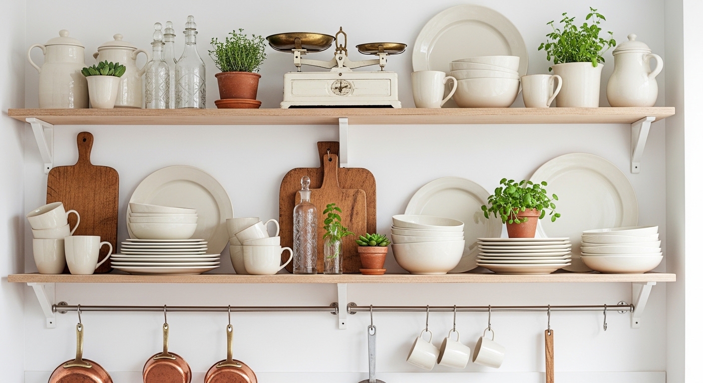
The most important addition to prevent coldness is wood, and it wants to be somewhere the eye lands: an open shelf in white oak with the everyday bowls on it, the butcher block island top, wooden bar stools, a cutting board leaning against the backsplash, the refinished floor. Leather pulls, a woven pendant, a plant in a terracotta pot and brass inside the pendants all do the same job on a smaller scale. The measure is about 10 percent of what you see: enough that the kitchen has a temperature, not so much that it becomes a Scandinavian kitchen with some black in it. We overshot once, with a wooden range hood cover, and the room tipped into cabin. It came off, and the black hood went on.
What her kitchen cost, and the sequence
Cabinets, flat-front, matte black lowers and one white tall, semi-custom: $9,800. Quartz counters, 42 square feet: $3,900. Butcher block island top: $640. Tile and installation: $1,750. Floor refinishing: $1,100. Faucet and pulls: $410. Pendants, strips, dimmers and the electrician: $1,280. Open shelving in white oak: $380. Paint: $210. Total, without appliances: about $19,500, over eleven weeks, of which three were waiting for the counters. Sequence: floor first (before cabinets, so the wood runs under them), cabinets, counters, backsplash, lighting, shelves, hardware. I'd have ordered the counters the day the cabinets were ordered rather than the day they were installed, and saved two of those three weeks, which is the note at the top of the spreadsheet I'll use for the next one.
Black and white kitchen ideas by budget
Under $500, no renovation: paint the lower cabinets matte black (a proper cabinet enamel, two coats, $90), swap the pulls for matte black bar pulls ($120 for twenty), replace the faucet ($164), and put 2700K bulbs in everything ($20). That's the 70/20/10 rule applied to the kitchen you have, and it's what I'd do in a rental if the landlord allowed the paint. Under $3,000: the above, plus a stacked white tile backsplash ($900 installed on a standard run), three black pendants over the island or the table ($450 with the electrician), and a white oak open shelf in place of one upper cabinet ($200). Under $10,000: cabinets refaced or replaced on the lowers only, quartz counters, the full lighting plan. The $19,500 version is the one where everything goes at once, and the only thing it buys over the $3,000 version, in the photos, is the counters.
Small black and white kitchens
In a kitchen under 100 square feet the proportion shifts to 80/10/10: black on the island or the lower run under the window only, white everywhere else, and the wood as the shelf or the stools. Too much black in a small room drops the ceiling. Keep the black low, keep the uppers white or gone, and use the under-cabinet strip to light the counter from the front, so the black lowers don't read as a shadow. A galley kitchen takes black on one side only, the side without the window. My sister's is 11 by 14 and it's at the top end of what I'd give 20 percent black; a friend's 8 by 10 galley got 10 and it was right.
The three mistakes to avoid, from the sample week
Checkerboard anything: floor, backsplash, a tea towel. Equal contrast at any scale is a diner, and the samples on the floor proved it in a day. Glossy black: it photographs like a mirror and shows the dishwasher's fingerprints by noon; every black surface in this scheme is matte or satin. And cool light: the whole week of samples looked fine under the 4000K bulbs that were already in the kitchen, and then dreadful in the late-afternoon window light, and it was the window that was right. Change the bulbs to 2700K before you judge a single sample, because the palette you're choosing is the one you'll see at night, under the light you install, and not the one in the showroom.
Does a black and white kitchen date quickly?
The 50/50 version does; it's dated on installation. The 70/20/10 version with matte black, flat fronts, warm light and real wood has been in magazines for a decade and looks like it'll be there for another, because it's a proportion rather than a trend. The parts that will date are the parts that are fashionable now: the specific pull shape, the exact tile format, the brass inside the pendants. Those are the cheapest parts to change, which is the point of putting the money in the proportion and the materials and not in the details. A kitchen is a fifteen-year decision; a cabinet pull is a fifteen-minute one.
Shop this post: kitchen pendant lights and matte black faucets