When I started thinking about lighting for our home in any coherent way, as a system rather than a series of individual purchases. The first question I had to answer was finish. Brass or matte black? I looked at my house and I saw both. The front door has brushed brass hardware. The kitchen faucet is matte black. The bathroom has chrome fixtures from the previous owners that I haven't replaced yet. It looked like a house decorated by three different people with three different opinions about metal.
I spent about a month researching this before I touched anything, and what I came to is a framework I've used consistently since: warm rooms get brass, utility and high-contrast spaces get black. It's not a rigid rule, but it captures the underlying logic well enough to make decisions quickly and confidently.
The 3-Finish Rule: The Foundation for Any Finish Decision
Before talking about brass versus black specifically, the most important rule in finish coordination is this: never use more than three metal finishes in a single room. I learned this principle from an interior designer whose work I've followed for years, and once you see it you can't unsee it. Rooms that feel chaotic often have four or five competing metal finishes, chrome faucet, brass cabinet pulls, nickel drawer hardware, black outlet covers, bronze light fixtures. Nothing reads as intentional because nothing echoes anything else.
In each room of our house, I identify three finishes maximum: one dominant, one secondary, one accent. The dominant finish appears most, lighting, plumbing fixtures, primary hardware. The secondary appears less, smaller fixtures, hinges, hooks. The accent is the smallest, a single decorative object, a small piece of hardware. Three finishes and they all need to be compatible in warmth tone: either all warm (brass, gold, bronze, copper) or all cool (chrome, nickel, silver) or one deliberate mixed pairing (brass dominant with matte black accent, warm with a cool counterpoint).
Why I Chose Brass for the Bedroom and Living Room
The bedroom and living room are the warmest rooms in our house in terms of palette, warm white walls, natural oak and walnut wood tones, linen and wool textiles in cream and sage. Brass completes this palette. It belongs in the same color family as the wood tones and the warm wall color. When I added brass wall sconces to the bedroom, they looked like they'd always been there. They didn't call attention to themselves as a design addition, they simply cohered.
I also find that brass reads as more crafted and intentional in warm living spaces than matte black does. Black reads as modern and minimal, strong and clean. In a room where I'm trying to create warmth and softness, black works against that. It adds contrast where I want continuity. Brass adds warmth where I have warmth. It amplifies rather than counterpoints.
The specific fixtures I chose: the Dagny wall lamp in the living room flanking the fireplace. The Dagny has a warm brass finish that photographs gold in certain light and more antique in others. That variability is part of what I love about it. It reads differently morning and evening, which is what I want from a living room fixture. For the bedroom, I chose the Amalia sconces, cleaner and more minimal, which suits the bedroom's quieter character.
Why I Chose Matte Black for the Kitchen and Bathrooms
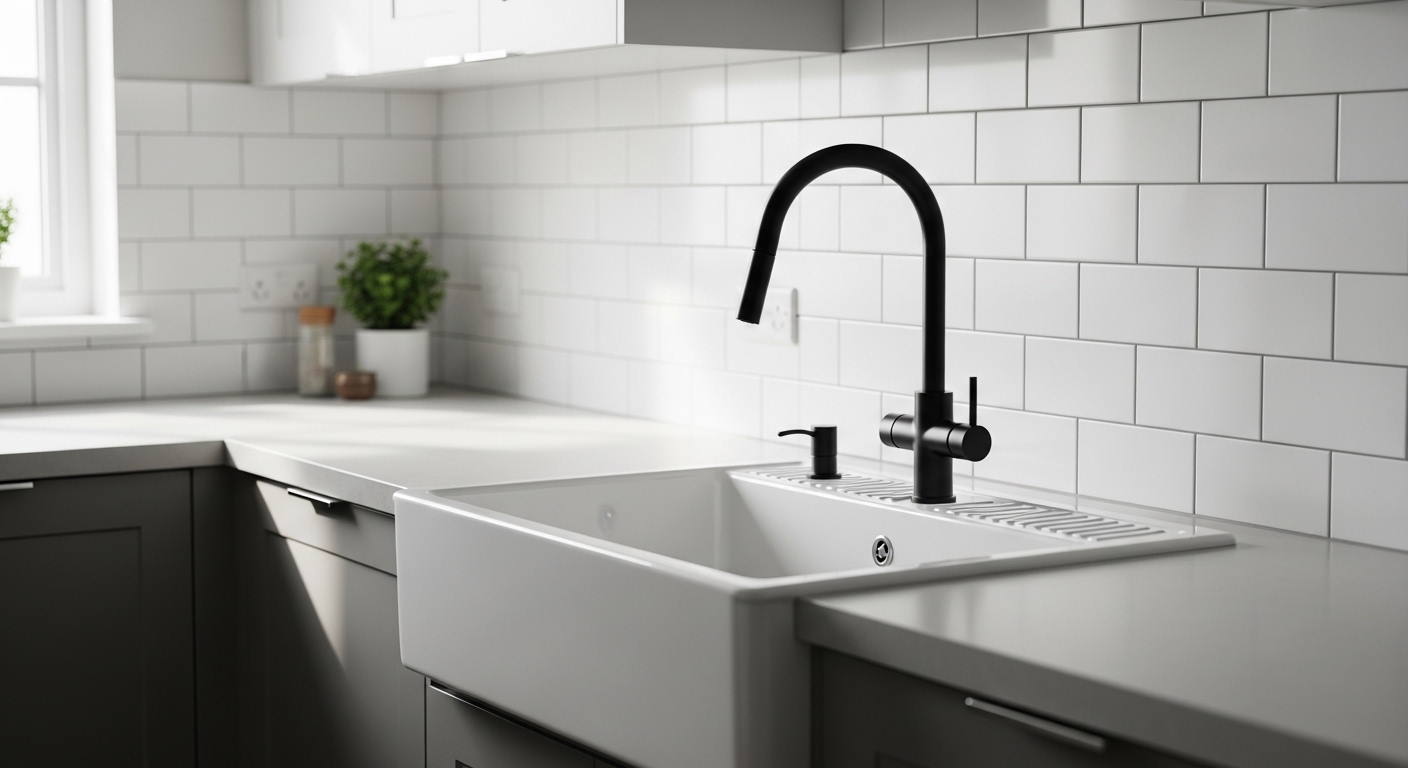
The kitchen is a working room. The primary bathroom is a utility space that happens to be designed attractively. Both have a function-first character that brass doesn't suit as well. Matte black reads as precise and sharp. It creates high-contrast punctuation against white surfaces. Our kitchen has white cabinets and white quartz countertops; matte black hardware and fixtures read as intentional and clean against that white field in a way that brass, which would compete with the white rather than contrast it, doesn't.
There's also a practical consideration: brass ages and patinas, which I love in the living room and bedroom. In the kitchen, that same aging reads as slightly worn rather than distinguished. Brass near a stovetop, near constant moisture and heat from cooking, develops an uneven patina that looks less intentional than the graceful aging it achieves in drier, cooler conditions. Matte black powder coat stays consistent. It's the same finish after a year of kitchen use as it was the day it was installed.
The modern wall sconces in our kitchen. We have two flanking the window above the sink, are matte black. Combined with the matte black faucet and the matte black cabinet pulls I installed last year, they create a consistent accent layer that runs through the whole kitchen. One finish, used intentionally throughout, reads as designed. Three different finishes in the same space would have read as accidental.
The Brass and Black Mixed Pairing, When It Works
There are spaces in our house where I've mixed brass and black deliberately, and this is worth addressing because it's a choice that works when handled carefully and fails when handled carelessly.
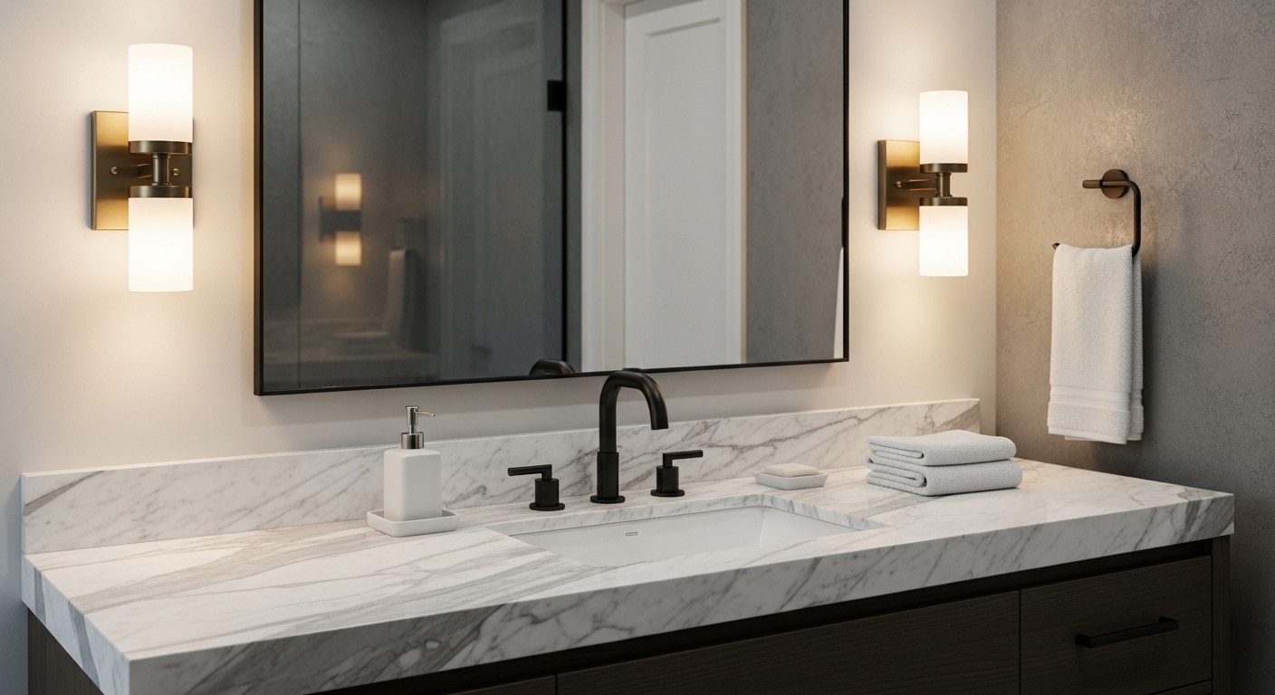
In our primary bathroom, the dominant finish is matte black, faucet, towel bar, toilet paper holder, mirror frame. The light fixtures above the vanity mirror are brass. This is the deliberate mixed pairing: cool dominant, warm accent. The brass fixtures soften the all-black scheme and read as a designed choice rather than an inconsistency. The key is proportion: the black dominates (roughly 70% of the metal in the space) and the brass accents (30%). Flip that ratio and it would feel muddled.
The rule I follow for mixed pairings: keep the warm metal in the higher positions (fixtures, mirrors) and the cool metal in the lower positions (hardware, plumbing). Light comes from above; fixtures that are warm feel right at ceiling or eye level. Hardware at hand level reads as functional, and the precision of matte black suits functional hardware well. This creates a space that feels both warm (because the light is warm) and clean (because the hardware is sharp).
Coordinating Across Rooms: The Whole-House View
Taking the whole-house view on finishes is the approach that resolves the chaos I described at the beginning of this post. Here's how our house breaks down now:
- Bedroom: Brass dominant. Sconces, nightstand lamp, small decorative pulls on the dresser. Oak wood tones are the complementary secondary element.
- Living room: Brass dominant. Fireplace sconces, floor lamp base, console hardware. Black accent on the fireplace surround paint color.
- Kitchen: Matte black dominant. Faucet, cabinet pulls, window sconces, pendant lights. Brass accent on a single small item (a brass measuring cup set that hangs on a hook, not hardware, but it serves as the warm accent in an otherwise all-black scheme).
- Primary bathroom: Matte black dominant with brass accent in fixtures. 70/30 split.
- Entry: Brass dominant, connecting to the front door hardware. Mini pendant is brass; console lamp base is ceramic (neutral).
Reading the list, you'll notice brass appears in the entry and all the "warm" living spaces; black appears in the kitchen and bathroom. This isn't because I followed a rigid rule about room function. It's because I made each decision by looking at what was already in the space and asking what would cohere. The pattern emerged from individual right decisions, not from a master plan.
What to Consider When You're Starting From Scratch
If you're starting a room from scratch and don't have existing hardware to coordinate with, here are the questions I'd ask:
What are the dominant material tones in the room? Warm wood, warm stone, warm textiles, go brass. Cool white, gray concrete, cool stone, go black or chrome. Neutral (white walls, gray linen, light oak). You have a choice. I'd still lean brass for living and sleeping spaces and black for utility spaces, but the neutral palette will support either.
What style register are you aiming for? Scandinavian, farmhouse, transitional, brass reads more naturally in these contexts. Mid-century modern, industrial, contemporary minimal, black reads more naturally. Neither is absolute: plenty of Scandinavian-inspired homes use matte black beautifully, and modern spaces often benefit from the warmth of a brass accent. But these are useful defaults when you don't have a strong instinct to override them.
The finish decision connects to everything else in a room. This is why I discuss it alongside paint color choices and Scandinavian design principles in my post on achieving Scandinavian design on a realistic budget. For the specific bedroom and living room lighting decisions that sit behind my brass choices, read my post on wall sconces vs ceiling lights. And if you're in the kitchen-pendant stage of your lighting decisions, my post on kitchen island pendant lights shows how the brass decision played out there specifically.
Michelle at The Wharton House covered the same question from the antique side in her post on mixing antique and modern lighting, her approach to finish bridging is worth reading alongside this.
Quick Answers
Q: Should I use brass or matte black lighting fixtures throughout my home?
The simplest framework: brass for warm-palette rooms (bedroom, living room, entry) and matte black for high-contrast utility spaces (kitchen, bathroom). Brass coheres with warm wood tones and warm wall colors; it amplifies warmth. Matte black creates clean contrast against white surfaces and stays consistent over time without patina development. Both can work anywhere. The choice should be made by looking at what the room already has, not by categorical rules.
Q: Can you mix brass and matte black fixtures in the same room?
Yes, when done deliberately. The most reliable approach: one finish dominates at roughly 70% of the metal surfaces, and the other accents at 30%. Warm metal (brass) in higher positions (fixtures, mirrors) and cool metal (black) in lower positions (hardware, plumbing) is the proportion I use. Avoid 50/50 splits. They read as indecision rather than design.
Q: What is the 3-finish rule for interior design?
No more than three metal finishes in a single room. One dominant, one secondary, one accent. And all three should be compatible in warmth tone (either all warm or all cool, or one deliberate warm-cool pairing). Rooms with four or five competing finishes feel chaotic even when every individual piece is attractive. The 3-finish rule creates the coherence that makes a room look designed rather than accumulated.